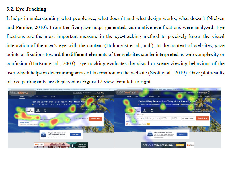
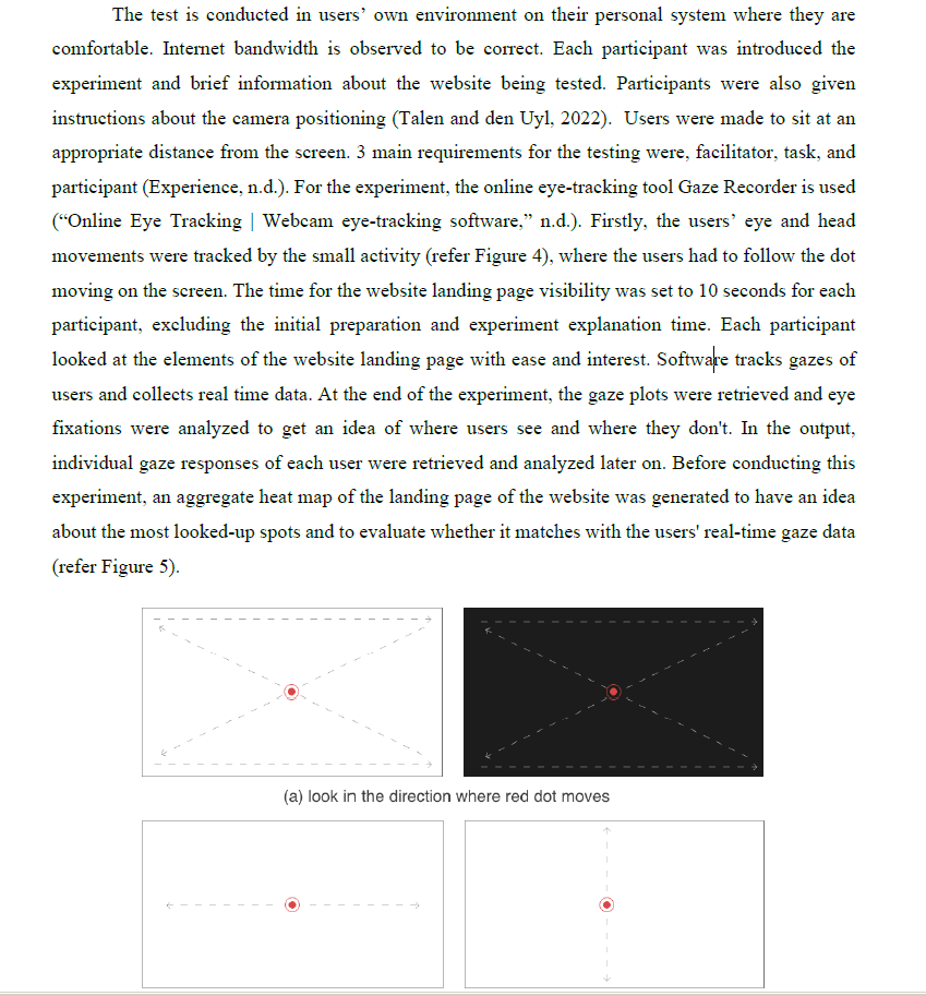
In this study, usability analysis on Fareportal’s OneTravel website has been done. OneTravel is a travel website that offers flight booking, hotel search, and many other services to a user. From a usability perspective, if the content is not accessible to the user in a simplistic manner, and he is unable to perform his goal effectively and efficiently, the user shifts to another company’s website very quickly This paper presents a combination of 5 usability testing methods including heuristic evaluation, eye tracking, usability questionnaire, and card sorting method which are conducted on the company’s website. The results of the experiments revealed potential usability problems which can be tackled by organization to enhance user experience of the website and retain more customers. The Heuristic evaluation suggested problems that were not aligning with general rules and standards. In eye-tracking, participants ’visual responses were recorded using online tools and analyzed to observe areas of interest. The Usability Questionnaire is used for the assessment of usability quality using a scale of 6 quality factors. To determine the relevancy of content layout on the website, a card sorting method is performed and an evaluation is done in comparison to the existing content layout of the website. All the methods revealed different problems and few common problems. Similar use of mixed methods and approaches can be implemented on other websites to identify users ’frustrations and to improve the usability of the website.

