In 2023, Nepal received approximately 104,885 foreign visitors for various reasons, including business, family visits, and educational purposes. As the primary gateway for these visitors, the effectiveness and user-friendliness of Nepal’s online immigration services are crucial. The Nepal immigration website plays a key role in facilitating visa applications, underscoring the need for an intuitive and user-friendly platform. This paper reviews major usability principles and explores the application of Human-Computer Interaction (HCI) components to improve the existing immigration website. By integrating Schneiderman’s eight golden rules for interface design with heuristic evaluation and applying Fitts’ Law along with eye tracking for usability testing, this paper proposes a dependable, evidence-based approach to designing a user interface for the immigration website. The engineering design process was used, and the Questionnaire for User Interface Satisfaction (QUIS) was completed as part of the studies. This paper aims to positively impact developers working on User Interface/User Experience (UI/UX) and Human-Computer Interaction (HCI), especially for websites that enhance digital platforms crucial to a nation’s operational efficiency, such as the immigration website.
Added:
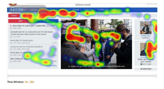
During the testing stage of the design process, we employed eye tracking to gain deeper insights into user interactions with the Nepal immigration website. Eye tracking is a crucial tool for understanding visual attention, as it reveals which elements of the design capture users’ focus and which are overlooked. For this purpose, we used Gaze Recorder, an online eye-tracking tool, to analyze user engagement with both the original and redesigned versions of the website. The eye-tracking data provided critical insights into user behavior, highlighting which interface elements gained the most attention and which were neglected. This analysis informed significant adjustments to the prototype to optimize layout, enhance visibility of essential components, and improve overall user experience. The redesign aimed to align users’ visual focus with the intended task flow, creating a more intuitive and efficient interface. The heatmap from the original website, shows a scattered focus, with user attention dispersed across the top navigation bar, a central image, and text links on the left sidebar. This dispersion indicates a lack of emphasis on key information, potentially causing user distraction. In contrast, the redesigned web page, demonstrates a more concentrated focus on critical elements such as the application steps and the “Application form” button. This indicates a clear information hierarchy and a streamlined user experience, guiding users efficiently through the necessary steps. The comparison underscores the effectiveness of using eye-tracking data to optimize web layouts, ensuring essential information is prominently displayed and easily accessible, thereby enhancing usability and user engagement.